To be honest, I think this is the hardest module overall because it is mainly about writing essay in English which is a foreign language for me. Therefore, it makes me feel hard to work on this module especially the requirement for this year is more difficult and challenging than COP1. However, I think I have tried my best to write the essay even though there may have many mistake in the English but I feel quite happy because I have completed it.
I think this year COP is more independent than last year because there was a limitation on the topic in COP1 which mean we couldn't write our choose the topic to write by our-self, however, we can decide any graphic design topic to write in this year which is more freedom. Hence, it is a lot better. I choose a really interesting topic which others may not know because it is about the characters of Traditional Chinese which is my first language, I feel really happy that I could write an essay about my first language in a second language, at the same time, I could tell or introduce more about Traditional Chinese to my tutor and classmates.
In the practical brief, I didn't know if the outcome looks success or not because this was my first time to produce a logo in my first language which I have never tried, usually, I just worked with English. Therefore, I still have a lot of things to learn even though it is my first language. I think it is completely different with working in English due to the fact there are different structure, characters, etc so I didn't know what to do before I looked at some examples. But I think this was a really great chance for me to try to work a logo in my first language, I think it is really benefit to me I could gain more experience working in other language(It means only working in one language, not a-crossing languages in logo).
Wednesday, 25 April 2018
Monday, 23 April 2018
Project statement
In my essay, I talked about the structure of Traditional Chinese characters, how did the traditional Chinese transformed to the one people use nowadays, etc. Moreover, the differences between Traditional Chinese and English characters. I read a lot of article about the history, theory, structure about writing traditional Chinese and how it influenced to the graphic design in HongKong nowadays. Therefore, in my practical project, I redesigned an international branding logo that have department stores in HongKong which can make more unique to foreigners or even local people.
I found that having Traditional Chinese in the logo can make people in HongKong feel the branding is representative due to the fact that it is their first language, it is true that not many branding only has Traditional Chinese in the logo, most of them also added with English because it is an international language. Due to this reason, I wanted to choose a popular and international branding to rebrand their logo in Traditional Chinese to make it more unique.
Pringles is the best choice for me as I found it also sell in the UK, it is quite famous in HongKong. Therefore, I tried to rebrand the logo by using Traditional Chinese rather than English.
Project proposal for COP3
This is a project proposal for COP3 in next academic year.
1)Research question:
- Normally the extension topic of my COP2, how to play with typography with traditional Chinese characters in graphic design.
2)Rationale:
- Due to the fact that I could talk about how to play with the characters in graphic design in my COP2 essay so I want to research about this question. Moreover, even though I am a Hong Kongers and I know how to write the character, however, I don't really know how do some designers design or play with the typography in traditional Chinese. Basically, talk about how it apply into the graphic design nowadays such as packaging, wayfinding system or restaurant menu, etc. This will make me understand more so that I can learn from it which benefits me a lot in my practice.
3)Contexts:
- Social?
- Technology?
4) Theoretical approach:
- How to use the character in a correct style(thickness, etc)?
5) Method:
- Primary: surveys, focus group?
- Secondary: Books, content analysis?
6) Practical Outcome?
- Try to make my own branding with traditional chinese in an appropriate way?
7) Resources?
- Different books about typography playing (traditional chinese) in graphic design.
- Online article
- Examples of design
8) Summer reading lists:
- A book in traditional Chinese called "字型散步-Font walk".
- Raster Imaging and Digital Typography II: Proceedings of the Conference on Raster Imaging and Digital
- Typography
- Logo design
- Modern Asian Design
9) Time planning:
 Project brief:
Basically, I am planning to extend my COP2 essay with a deeper research. I wanted to do something that is special with others for example I was thinking what I am different with others, it is true that the main different is language. Therefore, I wanted to use my own knowledge in the essay which the others don't have. I talked about the structure of traditional Chinese characters in COP2, however, I want to know more about how do people play with it (typography) when they designing graphic design outcomes like logo branding, wayfinding system or cover, etc. I believed that it would be really benefit to my skills because I probably will working in HongKong after graduate and this essay would enhance my ability on that.
1)Research question:
- Normally the extension topic of my COP2, how to play with typography with traditional Chinese characters in graphic design.
2)Rationale:
- Due to the fact that I could talk about how to play with the characters in graphic design in my COP2 essay so I want to research about this question. Moreover, even though I am a Hong Kongers and I know how to write the character, however, I don't really know how do some designers design or play with the typography in traditional Chinese. Basically, talk about how it apply into the graphic design nowadays such as packaging, wayfinding system or restaurant menu, etc. This will make me understand more so that I can learn from it which benefits me a lot in my practice.
3)Contexts:
- Social?
- Technology?
4) Theoretical approach:
- How to use the character in a correct style(thickness, etc)?
5) Method:
- Primary: surveys, focus group?
- Secondary: Books, content analysis?
6) Practical Outcome?
- Try to make my own branding with traditional chinese in an appropriate way?
7) Resources?
- Different books about typography playing (traditional chinese) in graphic design.
- Online article
- Examples of design
8) Summer reading lists:
- A book in traditional Chinese called "字型散步-Font walk".
- Raster Imaging and Digital Typography II: Proceedings of the Conference on Raster Imaging and Digital
- Typography
- Logo design
- Modern Asian Design
9) Time planning:

Basically, I am planning to extend my COP2 essay with a deeper research. I wanted to do something that is special with others for example I was thinking what I am different with others, it is true that the main different is language. Therefore, I wanted to use my own knowledge in the essay which the others don't have. I talked about the structure of traditional Chinese characters in COP2, however, I want to know more about how do people play with it (typography) when they designing graphic design outcomes like logo branding, wayfinding system or cover, etc. I believed that it would be really benefit to my skills because I probably will working in HongKong after graduate and this essay would enhance my ability on that.
Thursday, 12 April 2018
Final design

Idea development

In order to make it looks more serious, I added a short curly line as his mouth.

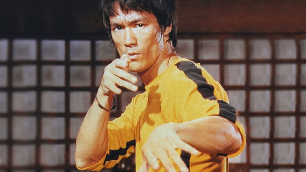
As I found that the yellow clothe is the most iconic of Bruce Lee, hence, I tried to draw it simply just in black and yellow with two circle as his hands so that it formed the position when Bruce Lee ready to fight.

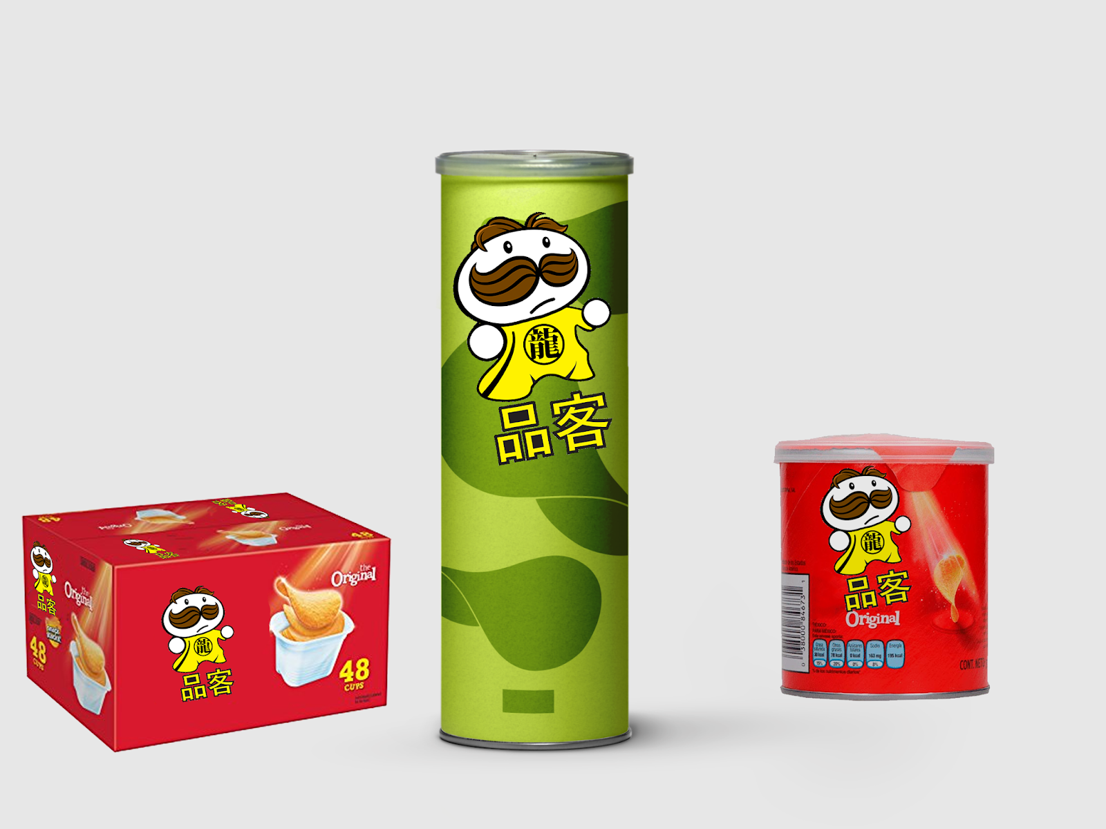
Afterward, it was the most important part in this project, I tried to work with different style of font but it has a limited Chinese font in Adobe software. So I tried to work with object as the font. The translated version should be "品客" Suddenly, I got an interesting idea, I was thinking to use Bruce Lee weapon which was called "Nunchaku", in every Bruce Lee movies, we can see he used Nunchaku all the time so I was thinking if I could make a character by using Nunchaku or not.
 |
| Nunchaku |


I tried with different thickness until I think it looks the best, in order to make it looks similar to the English version, I followed the style that how they did even though I couldn't do kerning in this two characters, in their original logo, I found that they made a black shadow under the characters so I did the same which looks similar.
I was thinking where could I playing with typography else rather than just "品客", due to the fact that my ideas was about Bruce Lee, I was also thinking about his name Bruce Lee in Traditional Chinese. His name in traditional Chinese is "李小龍". Due to the fact that "龍" means Dragon in Chinese and it is the most representative to Hong Kong so I decide to play with that character. The hand-writing of "龍" is quite difficult so I know that it couldn't looks too messy and shouldn't be too thick otherwise people may not see the word clearly.


Basically, I put it inside the centre of a circle so that it looks like the main idea of the clothes, when people saw this word with the colour and style of that clothes, they can get the idea immediately.

Idea sketching


Translated version of Pringles in traditional Chinese: 品客
Different parts compared with english version of Pringles: Number of characters are different, English has 8 characters while traditional Chinese only has two characters so the characters are quite difficult to do kerning
Same thing: Can use tiny curly style of font and make thicker outline
Inspiration

I looked at different examples from the website and I found one really interesting idea. Basically, it was the position when Bruce Lee ready to fight, I was thinking about if I could add this action with the Pringles character it would be really interesting. Moreover, it is the most iconic representation of Bruce Lee.

Another example was the logo of a Chinese restaurant in China using Bruce Lee as the icon. It is the same position like the above one.
Tuesday, 10 April 2018
Representation of Bruce Lee
To be honest, there are lots of things can represent Bruce Lee. For example, "Wing Chun", "Jeet Kune Do" and his movies. The most influence movie of Bruce Lee was the "The Game of Death" in Cantonese "死亡遊戲" as he died during the making of the film so it was the last movie of Bruce Lee. The best known from the movie was the yellow clothe that Bruce Lee wore. Therefore, I was planning to use this as a mark in the new logo.


How Bruce Lee influence in Hong Kong
Bruce Lee began training in the art of Wing Chun at Master Ip Man’s Studio. Martial arts became Bruce’s life, and he spent every waking moment practicing, but he didn’t necessarily stop getting into street fights. After an arrest when he was 17, his parents told him it would be safer for him to go to San Francisco.

During his time in America, Bruce continued his studies in drama and philosophy, met and married his wife Linda Emery and became the proud father of two children – Brandon and Shannon. He also began teaching martial arts and developed his own philosophy and martial art he named Jeet Kune Do.


During his time in America, Bruce continued his studies in drama and philosophy, met and married his wife Linda Emery and became the proud father of two children – Brandon and Shannon. He also began teaching martial arts and developed his own philosophy and martial art he named Jeet Kune Do.
A martial arts exhibition in Long Beach in 1964 eventually led to the invitation by William Dozier, an American film producer, to star in a new television series titled The Green Hornet. Dozier cast Bruce as a crime fighting martial-art expert named Kato. The show, only produced for one series, ended up making Bruce a star back in Hong Kong.
Bruce returned to Hong Kong in the mid-1960s. Producer Fred Weintraub had advised Bruce to return to Hong Kong and make a feature film that he could showcase to executives in Hollywood.
Back in Hong Kong, Bruce starred in five feature films that ended up putting Hong Kong cinema on the map. Notably, these films were The Big Boss (1971); Fist of Fury (1972); Way of the Dragon (1972), directed and written by Bruce; Golden Harvest and Warner Brothers’ Enter the Dragon (1973) and The Game of Death (1978).
Bruce’s kung fu films forever changed the way fighting was presented on screen. Before Bruce, fights were disorderly fisticuffs. After Bruce, most films with fight scenes incorporate kung fu movements – fights have become dances with acrobatic jumps and circus tricks

The release of Enter the Dragon (after Bruce’s premature death in 1973) catapulted Bruce to international superstar status. The film exposed many Westerners to the idea of martial arts for the first time, and many sought out martial arts instruction as a result of this movie. The film’s impact helped the Hong Kong film industry eventually grow to become the third largest in the world behind India and the United States.
Today, Hong Kong commemorates the life and legacy of its most famous son with a 2.5-metre bronze statue of Bruce Lee erected along the Avenue of Stars, a Hong Kong attraction near the waterfront in Tsim Sha Tsui.
 |
| 2.5-metre bronze statue of Bruce Lee erected along the Avenue of Stars |
Introduce of Bruce Lee
Bruce Lee was a revered martial artist, actor and filmmaker known for movies like 'Fists of Fury' and 'Enter the Dragon,' and the technique Jeet Kune Do.
Bruce Lee was born on November 27, 1940, in San Francisco, California. He was a child actor in Hong Kong who later returned to the U.S. and taught martial arts. He starred in the TV series The Green Hornet (1966-67) and became a major box office draw in The Chinese Connection and Fists of Fury. Shortly before the release of his film Enter the Dragon, he died at the age of 32 on July 20, 1973. His father, Lee Hoi Chuen, a Hong Kong opera singer, moved with his wife, Grace Ho, and three children to the United States in 1939; Hoi Chuen's fourth child, a son, was born while he was on tour in San Francisco. Lee received the name "Bruce" from a nurse at his birthing hospital, and his family never used the name during his preschool years. The future star appeared in his first film at the age of 3 months, when he served as the stand-in for an American baby in Golden Gate Girl (1941).
Bruce Lee was born on November 27, 1940, in San Francisco, California. He was a child actor in Hong Kong who later returned to the U.S. and taught martial arts. He starred in the TV series The Green Hornet (1966-67) and became a major box office draw in The Chinese Connection and Fists of Fury. Shortly before the release of his film Enter the Dragon, he died at the age of 32 on July 20, 1973. His father, Lee Hoi Chuen, a Hong Kong opera singer, moved with his wife, Grace Ho, and three children to the United States in 1939; Hoi Chuen's fourth child, a son, was born while he was on tour in San Francisco. Lee received the name "Bruce" from a nurse at his birthing hospital, and his family never used the name during his preschool years. The future star appeared in his first film at the age of 3 months, when he served as the stand-in for an American baby in Golden Gate Girl (1941).
Initial idea of visual investigation
Due to the fact that I wrote about the Traditional Chinese characters structure and some branding a-crossing in different language in my essay, hence, I wanted to rebrand a logo that is an international branding which is famous and selling their products in Hong Kong.
Reason of rebranding:
-Due to the fact that it is one of the most popular snack branding in Hong Kong so I want to create a new logo for Pringles just in Hong Kong so that it looks more specific and unique, when travellers travel to Hong Kong, they may also buy it because of the unique style.
Chosen branding:
-Pringles
Reason:
-It is one of the most popular snack branding in Hong Kong
-Also selling in the UK
-I personally love this branding
Ideas:
-Make the new logo be representative to Hong Kong
-Make it more unique than other Pringles products in other countries
-Use traditional chinese characters to replace the word "Pringles"

I listed my ideas that I think could represent Hong Kong, suddenly, I got an really interesting idea. I wanted to work with character. In that time, I was watching a TV series about Bruce Lee in Hong Kong and I thought of Bruce Lee immediately. I believe using Bruce Lee is a really great idea because of his effective, everyone around the world know him even he dead and one of the most important ting is that he truly represent Hong Kong the most so I think it would be funny creating a new Pringles logo in Hong Kong area with Bruce Lee.
Pringles


Along with the name, the company needed a logo for their potato crisps, so "Julius Pringles" was born. Originally, Julius represented a man's head in that he had a bushy black moustache, eyes, eyebrows, and parted black hair.
Everything went to hell around 2002:
1. They stopped keeping the parted hair inside the oval. That was part of the joy. A turn-of-the-century strongman who’d been out in the cold too long contained within a perfect round icon.
2. They took Pringles name out of the bow tie.
3. They gave Mr. Pringle pupils. Pupils!
Although none of these decisions have curbed my Pringles consumption, they pain me as a lover of branding and design. Pringles are just one of the hundreds of corporate logos that have fallen pray to Skeumorphic Design.
As design tools added more features, designers had the means to give more dimensions to these (intentionally) two-dimensional icons. Too often, logo designers have edicts to add more “air” or gradients to their styling. An easy way to “refresh” a brand is to give something more curve, or more fluff, or subtle colour changes. These decisions do little to elevate the brand. The most endearing corporate logos are those that have changed the least over time. Think Mobil, IBM, CBS or General Electric.

LANE NOODLE RESTAURANT AND BRANDING GENESIS, HONG KONG


It has always been they wish to explore Hong Kong’s culture with their design.
“The best food in Hong Kong are not served in restaurants but on the street”
Traditionally, back street alleys have been the typical venue for blossoming food vendors to be greet their customers in Hong Kong. Lane Noodle is situated at an alleyway off Smithfield Road, Western District. They took the advantage from this typological constraints and envisaged that we may extend this back alley into their shop and recreating this back alleys with various traditional Made-in-Hong Kong artifacts such as the folding chair, the Hawker Stands, the red rooster silk screen printing utensils, etc.
History of Hong Kong's Iconic ‘Two Girls’ Kwong Sang Hong Cosmetics Brand
History:
In 1898, only a handful of rich families and expats could afford foreign cosmetics. Seeing a gap in the market, Fung Fook Tien launched KSH. Legend has it that Fung’s branding was inspired by two beautiful women he spotted in the street, whilst another version suggests they came to him in a dream. Either way, Hong Kongers loved the brand, if only because it cost ten times less than its competitors.


In 1898, only a handful of rich families and expats could afford foreign cosmetics. Seeing a gap in the market, Fung Fook Tien launched KSH. Legend has it that Fung’s branding was inspired by two beautiful women he spotted in the street, whilst another version suggests they came to him in a dream. Either way, Hong Kongers loved the brand, if only because it cost ten times less than its competitors.

The girls featured on early labels and advertisements were actually men disguised as women, since – in feudal society – women were rarely allowed outdoors and models were impossible to find.

The success of the brand attracted many counterfeits and deliberate imitations though Fung pushed numerous landmark copyright cases through the courts to protect his business.

By the 1920s, KSH’s value had grown six-fold and real women were then being used in their advertising campaigns – it’s quaint posters were considered ‘art for the commoners’. Even throughout the Japanese occupation of WWII, the brand remained profitable despite their factory being burned down and stores being seized by the occupiers.
[Hong Kong] Old-fashioned HK breakfast at China Cafe
China Café is one of those old utilitarian “cha chaan teng” (teahouses) which serve sandwiches and simple rice or noodle dishes to the residents of the neighbourhood they are located in. 40 years old and counting, we stopped over at China Café enroute to Langham Place in Mongkok for a cuppa and some sustenance.
 Basically, these kind of restaurant, in their logo only contained traditional Chinese characters as it is an old utilitarian so the target may not be foreigners, however, in the modern time, the new utilitarians started to include English characters with traditional chinese characters to attract foreigners as Hong Kong "cha chaan teng" is really famous in Asia.

This is the new style of "cha chaan teng", the interior design is more modern and the most important thing is in their logo they added English under the traditional chinese characters so that foreigners can also understand what it is.


Coca cola
The classic Coke logo seems to come across just fine in most places, English speaking or not.But as the picture shows, the brand apparently found it advantageous to adopt the local lettering in 15 places, ranging from Taiwan to Somalia.


Coca cola in China:
When Coca-Cola was first sold in China in 1927, it was obvious to the Coke employees in China that the Coca-Cola trademark must be transliterated into Chinese characters. To find the nearest phonetic equivalent to “Coca-Cola" required a separate Chinese character for each of the four syllables. Out of the 40,000 or so characters, there were only about 200 that were pronounced with the sounds the Company needed, and many of these had to be avoided because of their meaning.
While doing the research for four suitable characters, the employees found that a number of shopkeepers had also been looking for Chinese equivalents for Coca-Cola , but with strange results. Some had made signs that were absurd, adopting any group of characters that sounded remotely like "Coca-Cola" -- without giving a thought to the meaning of the characters used. One of these homemade signs sounded like “Coca-Cola” when pronounced, but the meaning of the characters came out something like “female horse fastened with wax” and another meant “bite the wax tadpole.” That’s where the myth comes in! So the strange translation was in China, but not because of The Coca-Cola Company!
The character for “wax,” pronounced “La,” appeared in both signs because that was the sound the sign makers were looking for. Anyone who knew Chinese would recognise the signs as a crude attempt to make up an arbitrary phonetic combination – and get a laugh from the meaning!
Although the Company was primarily concerned with the phonetic equivalent of Coca-Cola , the employees could not ignore the meaning of the characters, individually and collectively – even if the shopkeepers had done so. They chose Mandarin because this dialect was spoken by the great majority of Chinese. The closest Mandarin equivalent to Coca-Cola was “K'o K'ou K'o Lê.” The aspirates (designated by ‘) were necessary to approximate the English sounds. There was no suitable character pronounced “La” in Chinese, so they compromised on Lê (joy), which was approximately pronounced “ler.”
Uniqlo logo
Uniqlo was originally designed to appeal to young Japanese who loved foreign things. The names is derived from “unique clothing” and the original logo, designed in 1991, was written only in English.


When Sato began his redesign, the first thing he changed was the colour. Instead of the deeper red, he switched to a brighter shade to match the rising sun of the Japanese flag. To continue with this cultural export, he added a second version of the name to sit next to the English letters written in Katakana, a set of characters used in Japan to represent foreign words. And his final touch was to keep the two versions of the name in red squares, imitating the Japanese chops or seals used to sign documents and works of art.

Basically, adding multi language in the logo is because it can show more cultural for a country to other foreigners.
Structure of Chinese characters writing
The structures of Chinese characters roughly can be divided into two different kinds, which are the single component (獨體字) and the compound (合體字). The single component refers to the characters that have only one complete and independent component, while the compound refers to the those characters that have more than one component. Despite that there is a small amount of single component, most of them are widely used or act as a part of the compound character.
Examples:
1. Left-Right Structure


2. Top-Bottom Structure


3. Enclosed Structure


3. Enclosed Structure


4. Top-Middle-Bottom Structure

5. Left-Middle-Right Structure

Subscribe to:
Comments (Atom)